
WALL OF SOUND
SERVICE
ROLE
TOOLS
PROJECT DURATION
WEBSITE REDESIGN (SCHOOL PROJECT)
UX/UI DESIGNER
SKETCH, PEN & PAPER, OMNIGRAFFLE, INVISION
2 WEEKS | NOV 2017

Overview
For this project, I was tasked with designing an online shopping experience for Wall of Sound, a record store located in Capitol Hill, Seattle specializing in genres for what they call the “discriminating listener." Wall of Sound's original website is more-or-less a landing page, as their online store is run through a third-party website called Discogs.com.
THE PROBLEM
Wall of Sound’s current website does not reflect their brand. It doesn’t provide the same level of care, curation and display that their customers love so much about their storefront. Because of this, online customers are not getting the same positive, whole experience that they would have in the store.
Ecommerce is handled through a third-party site called Discogs.
The current website has no navigation or active links.
The current website does not feature an 'about' page for users to read about the store’s cool and unique story.
Poor layout design as a whole.
The Solution
Completely redesign Wall of Sound's website to give users the same positive, personalized experience that they would have in-store:
Remove the third-party site Discogs from the equation and bring the online store in-house.
Add a navigation.
Add curated lists.
Add a social feature.
Give space for Wall of Sound to tell their awesome and unique story.
Focus on the display and visuals.
research & Discovery

THE ORIGINAL WEBSITE
My first move was to study Wall of Sound's current website inside-and-out. This was a very quick process, as the site didn’t even have a navigation! The only clickable items were:
To sign up for their email list (which was a broken link).
To shop their vinyl, which takes you to an external website. As I mentioned above, Wall of Sound currently runs their online store through a third party website called Discogs.


Contextual Inquiry
My next move was to visit Wall of Sound's storefront to get a feel for the store's brand and overall vibe. From chatting with one of the owners who was running the register, it became clear that what sets Wall of Sound apart from other record stores is how much care goes into their selection, and how finely curated and displayed everything is. This store's selection is more rare, unique, and smaller than any other record store here in Seattle.
COMpETITIVE / COMPARATIVE ANALYSIS
During the discovery stage, I also looked into a couple of similar businesses (locally and non-locally) to get a feel for the competition, and what experience they were providing for their users online. I also conducted comparative analysis and researched other websites that organized music, such as iTunes, Spotify, and a couple of popular music blogs like Pitchfork.

The User
For this project, I was assigned a primary persona to use as a tool to help guide my redesign. Important things to note about John are:
He is an art teacher and cares a lot about design
He is very vocal about brands that don’t meet his high expectations
He wants to have many options at his fingertips
He needs social proof from others to know what's cool
KEY FINDINGS / ideation
From research, I found that the current site just doesn’t provide the same level of care or curation and display that their customers love so much about their storefront. As the website currently stands, John (my persona) would just not be about it. He has only two options on the site, and as a whole it isn't impressing his design eye.
the question I tried to answer through my ideation process was, how can we build a website and ecommerce experience that would better serve John given his online shopping needs?
design solution
The answer was to completely redesign Wall of Sound's website. This meant:
Removing the third-party site Discogs from the equation and bringing the online store in-house. Based on my research, the primary use of a record store’s website is for customers to be able to access and purchase products online. Outsourcing the ecommerce function doesn’t make sense.
Adding a navigation. Once we bring the ecommerce function in-house, give the user a simple navigation and product filtering process to get to where they need to.
Adding curated lists. Because John needs a feeling of relationship with the brand, adding curated lists like staff recommendations would be beneficial to the new website. Also, because John wants to know what’s new on repeat visits, let’s have the homepage present a display of what’s new in the store.
Adding social features. John needs social proof from others to know what's cool so let’s give the site a social feature that would allow him to read reviews and customer Q&As.
Giving space for Wall of Sound to tell their awesome and unique story. Create an 'About' page, and also a section in the product descriptions for 'Wall of Sound Notes.' Since so much of the music they sell has a unique story, let’s have a place for the curators/owners/stakeholders to share their notes. This is a way for John to feel connected with the brand.
Focusing on the display and visuals. As an art teacher, John really cares about design. This means that what we build will have to be intentional and sleek. In my new design, I wanted to emulate the record digging experience for the users, and feature a homepage with large album artwork creating a literal WALL OF SOUND.
CARD SORTing
Now that I had a design solution, my next move was to conduct a card sort with various users. This was to help organize the new elements that would be included on this site that I mentioned above, with heavy priority on which elements would be included in the new navigation. I also wanted to get a feel for how the filtering function would be organized, including items such as genre, format, condition, etc.
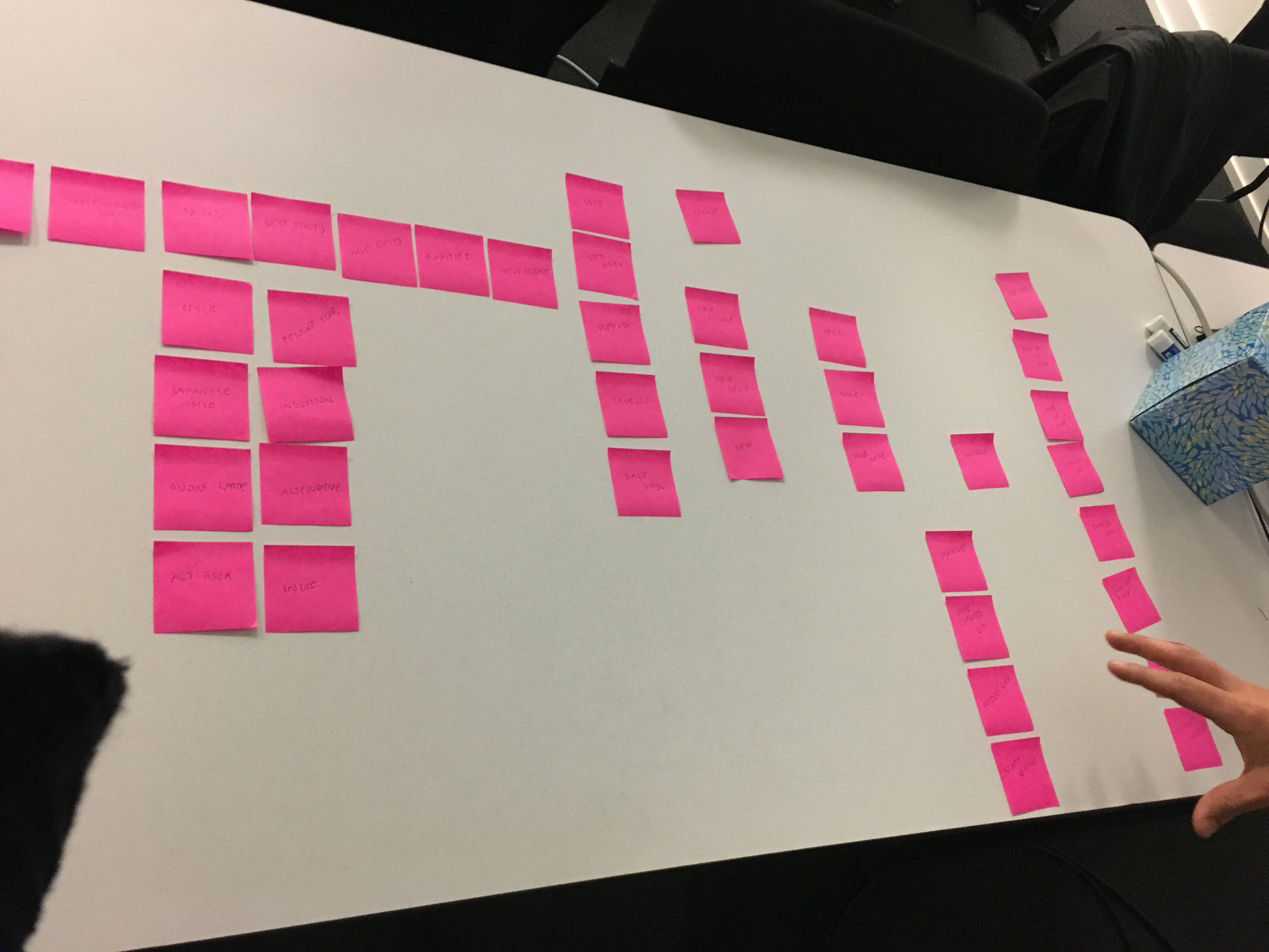

NEW SITE MAP
Using my results from the card sort, I created a new site map. As you can see, the navigation includes vinyl, CDs, cassettes, about us, and contact us.
EARLY CONCEPTS / SKETCHES
Using my new site map, I began sketching. Early concepts were inspired by Spotify, Pitchfork, and Ameoba Records before I was able to zero in on a design that Wall of Sound could call their own. Many online record stores tried to feature big displays and visuals, but their huge inventory really worked against them. In Wall of Sounds case, I really wanted to take their small, curated selection and use it to our advantage to create something clean and minimal, but still visual.

EARLY CONCEPTS
(L to R) HOME, PRODUCT LISTINGS, PRODUCT DETAILS, SHOPPING CART.
Wireframes
From here, I translated my sketches into wireframes to create an MVP to test on. Shown are select screens from this MVP.
HOME (MVP). SHOWN ON THE RIGHT SHOWS WHAT HAPPENS WHEN A USER HOVERS OVER ALBUM ARTWORK.

HOMEPAGE (MVP). ON THE RIGHT ARE WHAT DETAILS ARE SHOWN UPON HOVERING OVER ALBUM ARTWORK
PRODUCT LISTINGS (MVP). SHOWN ON THE RIGHT IS HOW THE FILTERING BAR WOULD FUNCTION.

SHOP VINYL LANDING PAGE (MVP)
product details (mvp).

PRODUCT DETAILS (MVP)
checkout (MVP).
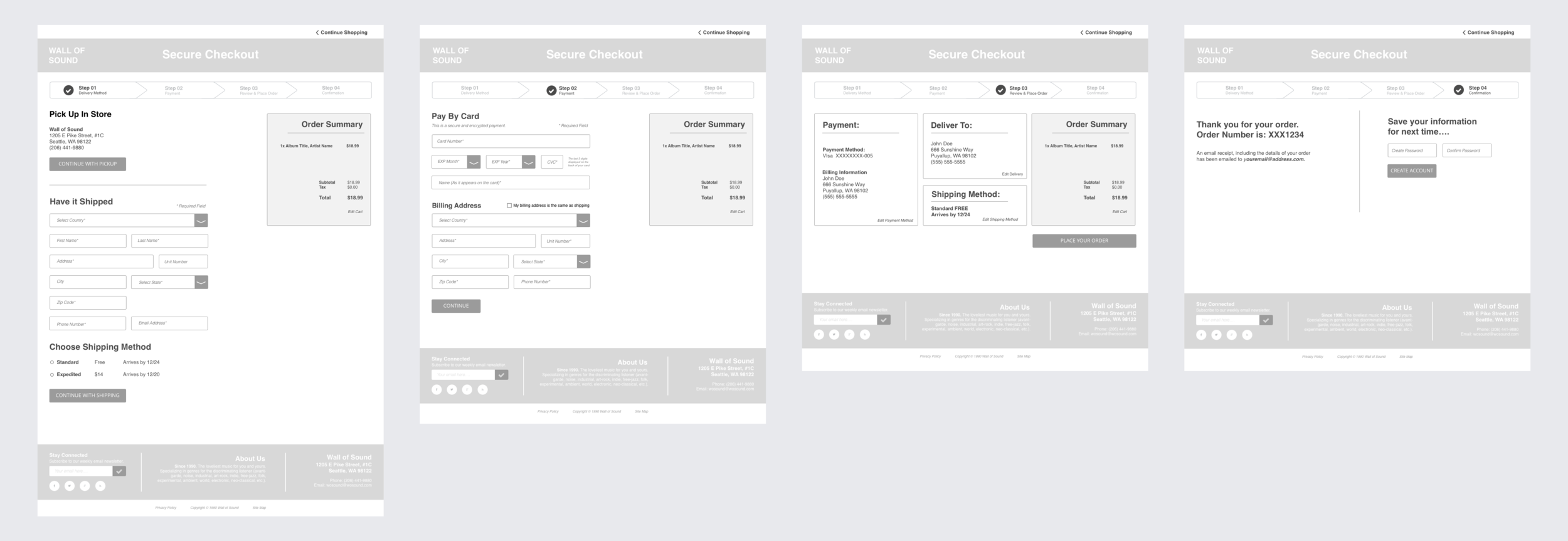
CHECKOUT (MVP)
Usability Testing & Iterations
Using my MVP, I conducting multiple wounds of usability testing with 6 users who were asked to go through a process of product discovery to checkout.
Most consistent feedback I received during my usability tests:
Filter bar should be higher up on the page during the product listing (John wants quick access to a wide range of options, and having it almost below the fold)
The stars on product pages should be clickable which is not pictured here.
I iterated my design based on these results, and afterward ran more user tests and the design was validated by my users.


final design/prototype
THE SCENARIO
John's 12-year old daughter has recently shown an interest in electronic music. As an avid music follower, John feels that this is an opportunity to really connect with her. He would like to surprise her with a super cool, affordable electronic vinyl record under $20. With a busy week ahead of him, will need to have it delivered.
conclusion / reflections
Through my redesign of Wall of Sound's website, users are now able to order music in one place. In addition to this ease of use, users can also feel like they have a sense of relationship with the brand. Wall of Sound's vibe of careful creation is carried throughout the new website, with curated lists such as "Staff Picks'" and "What's New" highlighted on the home page. Overall, everything is now in once place, making it easier on the user to make purchases.
In this project, I learned the importance of contextual inquiry. Since so much of my redesign was to reflect Wall of Sound's brand, visiting the storefront was invaluable. In this project, I also learned how to use a persona as a design tool. Although it felt awkward at times to personify a fake person, I eventually got used to it and John's preferences truly guided my design journey.
NEXT STEPS
More user testing, especially on the social side. Do reviews need their own section, or can we keep them in the scroller under product details?
Build out the user profiles. For example, a dashboard that would give recommendations based off of a user’s past purchases. Maybe a rewards system for users like a 'frequent buyers club.'