
Seahawks
SERVICE
ROLE
TOOLS
PROJECT DURATION
APP REDESIGN, IOS (SCHOOL PROJECT)
INTERACTION DESIGNER
PEN & PAPER, SKETCH, INVISION
2 WEEKS | DEC 2017

overview
My group was tasked with understanding the current usability problems of the Seahawks Official App in order to make recommendations that will help improve the customer experience. Our main objectives were to (1) minimize confusion around purchasing tickets and (2) optimize the game-day experience for fans.
Researcher
Erika Spoden
Information Architect/
VIsual Design
Dominic Martinez
Interaction Designer
Kristin Henry (me)
The problem
A user wants to be immersed in the Seahawks experience by using the app, but the app's competitive differentiators are hard to find. Many fans are not aware of the existing app because its poor IA has effectively limited its appeal and business potential.
the solution
Rework the app's information architecture to highlight its competitive differentiators. Give the users the experience of being at the game if they are not, and of being part of the game, if they are by highlighting what makes the app unique.
discovery & RESEARCH
As the Interaction Designer, I worked hand-in-hand with my team's Researcher, Erika Spoden, during the discovery phase. I first took some time to dive deep into the current app in order to see its existing functions and get a full picture of all that it had to offer its users. I went through every page, paying close attention to the portions involving gameday and ticketing. At this stage, it was already becoming clear that the app's information architecture was a little off.


I assisted our Researcher with usability testing on the original app. Below is the guide our Researcher created for our usability tests. While running tests on the original design, I asked multiple users to complete the following tasks:
You have bought tickets to the next game, but can’t remember where you’re sitting. Where in the app would you go to find this?
You want to buy tickets for the next home game. Where in the app would you go to find this?
You are at the game and see an unattended backpack next to a garbage can. Where in the app would you go to report this incident?
You’re coming in from Lynnwood for the game at CenturyLink field and would like to see if there are any traffic incidents you should be aware of. Where in the app would you go to find this?
You would like to find highlights from yesterday’s game. Where in the app would you go to find this?
The User
My last contribution to research was creating the protopersona that would eventually become the primary persona that would help guide my team's design journey. Listed below is my preliminary version of Chad Fielder. Chad is a Rales Representative born and raised in Enumclaw, WA. He is a diehard Seahawks fan, and attends about 1-2 games per year with his close buddies. His goals with the app are (1) to find a way to access cheap home game tickets quickly and (2) have an interactive way to follow the games from home, when he is unable to attend in person.

DEFINING & IDEATING

ORIGINAL SITEMAP
POOR INFORMATION ARCHITECTURE
From reviewing the results of our preliminary usability tests on the original app, it quickly became very clear to my team that the primary issue was poor information architecture.
If our Chad, our protopersona, wanted to purchase tickets or view the Gameday guide, he would have to dig around in the 'More' tab. During usability testing on the original app, users were increasingly frustrated by its poor organization. Items that should be at the forefront of the app, such as buying or upgrading tickets, were difficult to find, buried in places a user would never think to look first. To users, there was nothing that the existing app did that cannot be done more quickly using Google.
Once my team determined that poor IA was the root of the issue, our design solution was to simplify the app altogether. My team's Information Architect conducted rounds of card sorting with users in order to help group existing items within the app. During this time, I also did additional research and downloaded other popular apps that were related to sports, teams, and ticketing, such as ESPN, Ticketmaster, taking note of the IA, with special focus on tab bars.
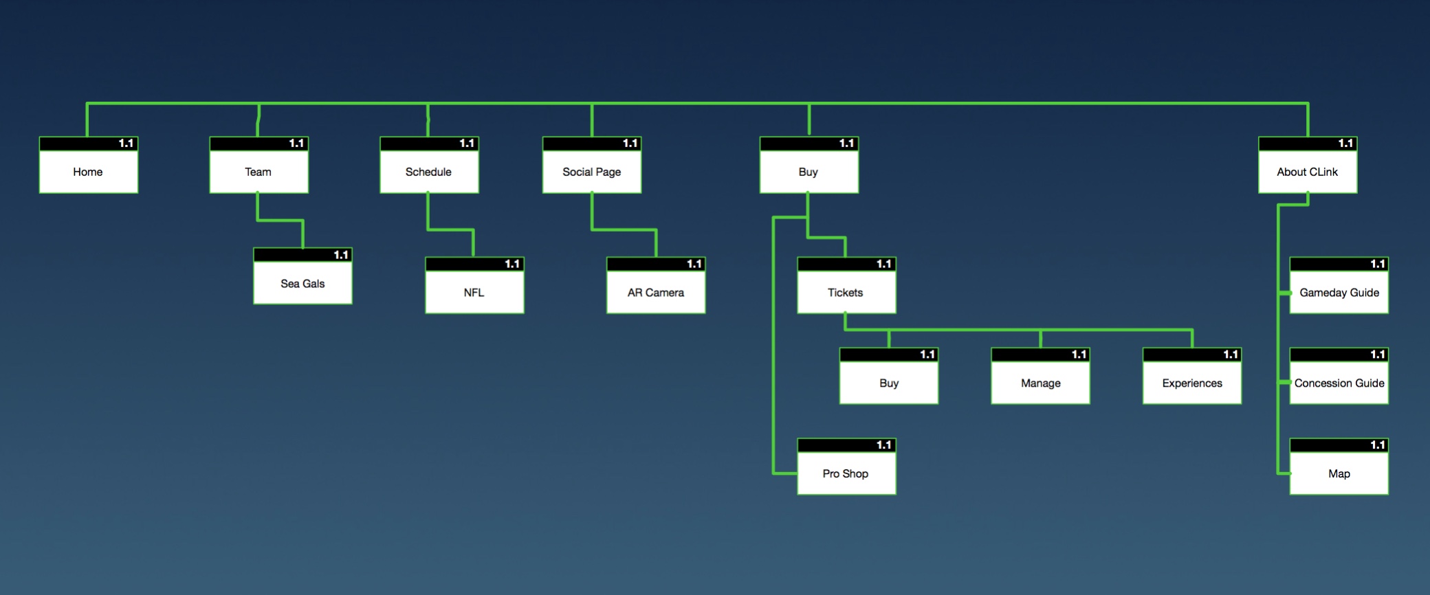
After more research was conducted, my team's Information Architect was able to present a new site map that:
Made ticketing easier to find. In the new architecture, ticketing would be under a newly created 'BUY' tab.
Presented different Gameday functions for users who were at the game. In order to help optimize the Gameday experience for users who were at CenturyLink, there would be certain functions of the app, such as concession delivery, that are only available to those on site at the game.
NEW SITEMAP (INSIDE STADIUM)
NEW SITEMAP (INSIDE STADIUM)
NEW SITEMAP (OUTSIDE STADIUM)

Sketching
Using the new sitemap (inside stadium), I began ideating and sketching the main screens of the app. Below are my initial concepts.

wireframING
After presenting my initial sketches to my team, I started digitizing my wireframes in Sketch, building around our key scenarios. As I mentioned earlier in this case study, my team's first objective was to minimize ticketing confusion for our users. In the app's original design, a user would have to find ticketing under 'MORE' > 'PURCHASE EXPERIENCES.' In the new site map, my team opted to create a new “BUY” section in the tab bar to make ticketing easier for the user to find.
TICKETing (MVP)

To buy tickets, a user would:
Click the 'buy' icon on the tab bar to get to the buy landing screen, then...
...Select Buy Tickets under the Seahawks Ticketing Resources section of this screen. This would then take the user to another screen that lists upcoming games. Each of the ticket images are clickable. Once a user knows which game they would like to attend, all they have to do is select it, which would then take them to Ticketmaster to finish the purchasing experience. From looking at other sports team apps, Ticketmaster was the standard and most trusted.
Our secondary scenario was around buying concessions at the game. One of the unique things about the existing app is that through it, users who are at the game and sitting in club level are able to have concessions delivered to them. Since our client was looking for ways to improve the customer experience by finessing already existing features, our business recommendation was to make this feature available to everyone at the stadium. The MVP is shown below. From the GAMEDAY screen, an 'Order Concessions' card is presented. Once a user clicks this 'Order Concessions' card, they are taken through pages that present food and beverage options. Once they make a selection, they are then moved through the checkout screens.
CONCESSIONS (MVP)

testing & iterating
TICKETing
Using my MVP above, I assisted our Researcher in conducting multiple usability tests. We learned that on the buy landing screen, users wanted to have an option presented where they were able to purchase single game tickets instead of the menu of options that was originally presented in the MVP. Based on this feedback, I iterated the design to show a “Buy Single Game Tickets” section with a scrolling list of games.
FINAL DESIGN

CONCESSIONS
I also assisted our researcher in conducting multiple usability tests using the CONCESSIONS (MVP) above. Using the results of these usability tests, I made 6 iterations:

1. Make “order concessions” available on both the “GameDay” and “Buy” landing screens.
During usability testing, our researcher found that multiple users very quickly hit 'BUY' when asked to order concessions from the app instead of going to 'gameday.' based on this, we made the feature available in both places.

2. remove the Order Concessions button from the home screen.
during usability testing, We had multiple users who were super confused about why it was prioritized so high on this screen, right next to replays. the hierarchy was just off on the MVP, so I went ahead and removed that from the home screen, given that there were still two ways to reach order concessions (thanks to my last iteration).
3. Reorganize the food categories and add a search function. In our MVP, i kept the food categories the same as the original app. Through usability testing, we learned that users look for “beverages” and “snacks” first at games. So i iterated, and made the Order Concessions landing screen a more general area with beverages and snacks at the top, followed by a list of different cuisines. When our researcher tested this, we still had a lot of users confused about the food categories, so i also added a search bar to these screens to see if that would help. our researcher ran another set of usability tests while I observed, and adding the search function definitely minimized user confusion.

4. make sure everything fit the iOS Human Interface Guidelines. I noticed that during usability testing on the MVP, iPhone users were confused about the checkout forms. i realized that its because i was using a few web styles. Based on this feedback, I changed the forms and added new screens to fit the iOS Human Interface Guidelines. this tested a lot better with our users.

5. add a confirmation screen and delivery countdown. In the MVP, there was no confirmation screen. Once a user would hit “place order,” it would take them straight to the home screen with no further details about their order. Users were super confused by this, so I added a confirmation notification and added a detailed timer/countdown icon that shows how many minutes until their order is delivered to their seat.

final design/prototype
Using my protopersona Chad Fielder as a design tool, I built my final prototypes.
Ticketing
(Chad's Scenario)
Chad is at lunch with one of his buddies, talking about last week's Seahawks game and expressing how badly they both wish they could have been there. On a whim, they decide to buy tickets to next week's game. Chad has the official Seahawks app already downloaded on his iPhone, mostly to keep up with Seahawks news, so he opens the app to find tickets to next week’s game for both he and his friend to go.
CONCESSIONS
(Chad's scenario)
It’s been 4 days since Chad used the official Seahawks app to buy his tickets, and today is Gameday. Chad is so excited to be at this game and has just arrived to his seat. He realizes he is hungry and opens the app to look at what vendors are close to his seat. After clicking the “Buy” screen, he notices an “order concessions” button and realizes that, through the app, he can order food and have it delivered to his seat. He confirms his location, then moves through the app to order a hot dog and have it delivered to his seat.
REFLECTIONS
What this project taught me most is the value of working on a team. This was my first group project as a UX Designer, and while I was a bit apprehensive in the beginning about roles being siloed, in the end the new design was better-off because of my team's synergy. I also learned the importance of simplifying when it comes to design. Sometimes, adding new features is not the answer... Part of being a UX Designer is knowing when it is appropriate to add and innovate, and knowing when to pull back and simplify.
NEXT STEPS
More User Testing
Optimizing the Social page
Building out the user Accounts Page