
REBAR CAPITAL
SERVICE
ROLE
TOOLS
PROJECT DURATION
Website Redesign, branding refresh
UX/UI + visual Designer
SQUARESPACE, adobe illustrator
2 MONTHs | aug-sep 2018
Overview
Rebar Capital is a private equity firm specializing in commercial real estate investments and management. The team at Rebar Capital seek undervalued investments in commercial real estate for purchase, improvement, operation, and resale. I was tasked with a full website redesign and a revamp of the company’s branding (color palette, typography, logo). The goal was to give Rebar Capital a modern touch while still providing their users with a simple, and intuitive website that would provide real value to it’s users.
the BEFORE
Rebar Capital’s previous website was rudimentary. Information was presented primarily through text. There was no intentional use of color, and there were very few, if any, visuals to break up pages. The logo also felt out of place in the navigation.


the SOLUTION
A new website that:
Causes delight in the simple, clean user experience
Causes delight in the human scope and feel of the site and its intuitive flow
Introduces the viewer to REBAR
Is content-rich, educational, meaningful
Coaxes the viewer to follow its flow to their desired interaction points
DISCOVERY
My first move was to conduct an interview with Ken Mulford, our primary stakeholder, in order to find out the following:
What is already known about the users?
What is Rebar’s background story?
What are the business goals (so later, I can see where the user goals and the business goals align)
Who are Rebar’s known competitors?
STAKEHOLDER INTERVIEW KEY FINDINGS
Users: Rebar’s target demographic is Real Estate professionals. They are contractors, developers, and realtors. Our user will be educated, have financial acumen, and most likely have a basic understanding of the process for rehabbing a building.
Competitors: Many of Rebar’s competitors take a very aggressive approach on their websites, with many modals and pop-ups pushing the user. Ken’s goal as a business is to be as informative as possible. This was a big takeaway for me in how I wanted to design the website. Keep it informative, pleasant, and give the user the ability to exit with ease. No sales pitches. No asks.
THE DESIGN PHASE
DESIGNING ON SQUARESPACE
Due to budget constraints, my client wanted to go the Squarespace route instead of a custom site. After my initial stakeholder interview, I took some time to research existing real estate websites that were built through Squarespace. From there, I looked through Squarespace’s existing templates with hopes to land on one to customize myself. After I selected a template, I went straight into building (for custom sites, I would usually follow the process of sketching/low-fidelity wireframing, but because (1) I was working on a timer and (2) I was familiar with Squarespace, I skipped that phase).
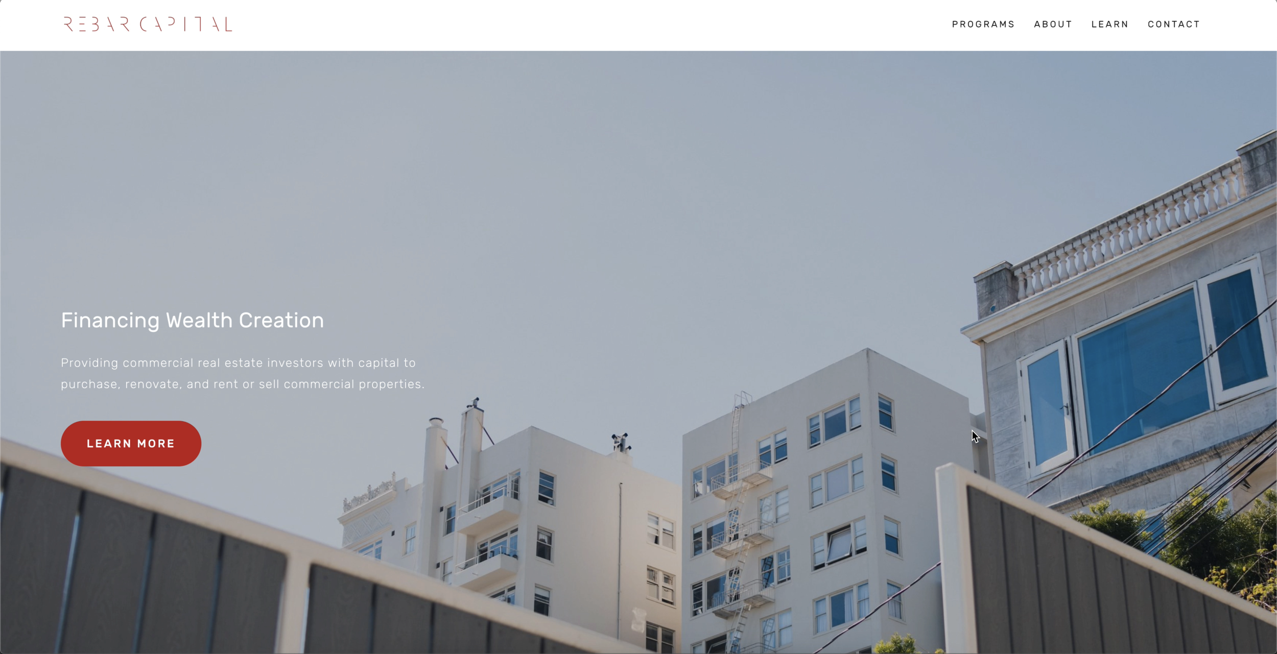
THE NEW DESIGN
REFLECTIONS
DESIGNING WITHIN THE CONSTRAINTS OF SQUARESPACE IS TOUGH FOR ANY DESIGNER WHO PREFERS THE FREEDOM OF CUSTOM, BUT WE DEFINITELY MADE IT WORK
I WOULD HAVE LOVED TO HAVE ACCESS TO REAL-LIFE USERS AND HAVE ENGAGED THEM AT ALL PARTS OF THE DESIGN PROCESS
OBSERVATION DURING THE DISCOVERY PHASE
USER INTERVIEWS DURING THE DISCOVERY PHASE
USABILITY TESTS AFTER MVP WAS ROLLED OUT